Friday, July 29, 2011

St. Francis Mural Project

We assembled the mural yesterday to shoot new pics.  Unfortunately, the cafeteria where we normally shoot, was in use.  We found a space large enough for the mural in the great hall at JD, but the light was not very good.  Another issue was that I had to get really high above the mural to fit it all into frame, hence the cherry picker.  At 30' up in the air, this thing wobbles...A LOT.  Long story short, the pics of the art did not turn out well...very dark and blurry.  I will post new pics hopefully on Monday.

Tuesday, July 19, 2011

St Francis Mural Project


Father Dave and Julie stopped by the studio last week, here we are chatting about the mural.  I like these pics because of our gestures.  I don't recall exactly what we were talking about, but it looks very serious.  Thanks to Pat Bayer, the Coordinator of Special Rites at JDCHS, for taking these great photos!

Here's another shot from last week minus the cropped figures.  I've made a lot of progress on the path over the last couple days, will post new pics soon.

Saturday, July 16, 2011

St. Francis Mural Project


 Working on color.  I lost a few days of painting this week due to my ailing back, but now I am back on the right path.

Working on this large scale has forced me to make some changes to my painting process.  I've realized that what looks good up close will not necessarily translate as such from a distance and vice versa.  Sometimes it feels as though I'm painting an abstract work because up close all the forms (people, path, clouds, etc) dissolve into patterns of flat shapes and colors.  It is only when you take a step back that all the shapes and colors merge together to create a picture.  This is a wholly different experience from being hunched over an easel with my face inches from the canvas.


The first few strokes of color in a painting can be frustrating because color can play tricks on you.  Color is relative, meaning it will change depending on which color it is placed next to.  For example, the brown color of the path looks very orange because of the neutral greys it interacts with.  I'll quote one of my painting heroes, Josef Albers, "In visual perception a color is almost never seen as it really is - as it physically is. This fact makes color the most relative medium in art."


Someone got a new haircut.

This is the paint I use, it's Liquitex soft-body acrylic.  It's pretty awesome (and expensive) stuff.

Friday, July 8, 2011

St. Francis Mural Project


The under painting is just about finished! I assembled the mural on the cafeteria floor at JD because it was the biggest space I could find.  I shot these photos from the 2nd floor hallway that overlooks cafeteria.  Unfortunately, a lot of distortion occurred because I was taking pic from a weird angle, which resulted in the cropping of figures.  Although the picture quality isn't great, you can still get an idea of what the mural will look like.  Color next week!

Tuesday, July 5, 2011

St. Francis Mural Project

 Touching up second row.  I'm quite happy with the way things are going so far, but it's important for me not to get too attached as I will eventually cover everything up with color.  So why even do a black and white under painting you ask?  I believe value (the lightness or darkness of a color) is more important than color.  Although one notices color first in a painting, it is the subtle shifts in value that creates sculpturesque form.  As long as the values in a painting are correct it almost doesn't matter what color it is because it will still read as a 3D object.
 Molly approves.


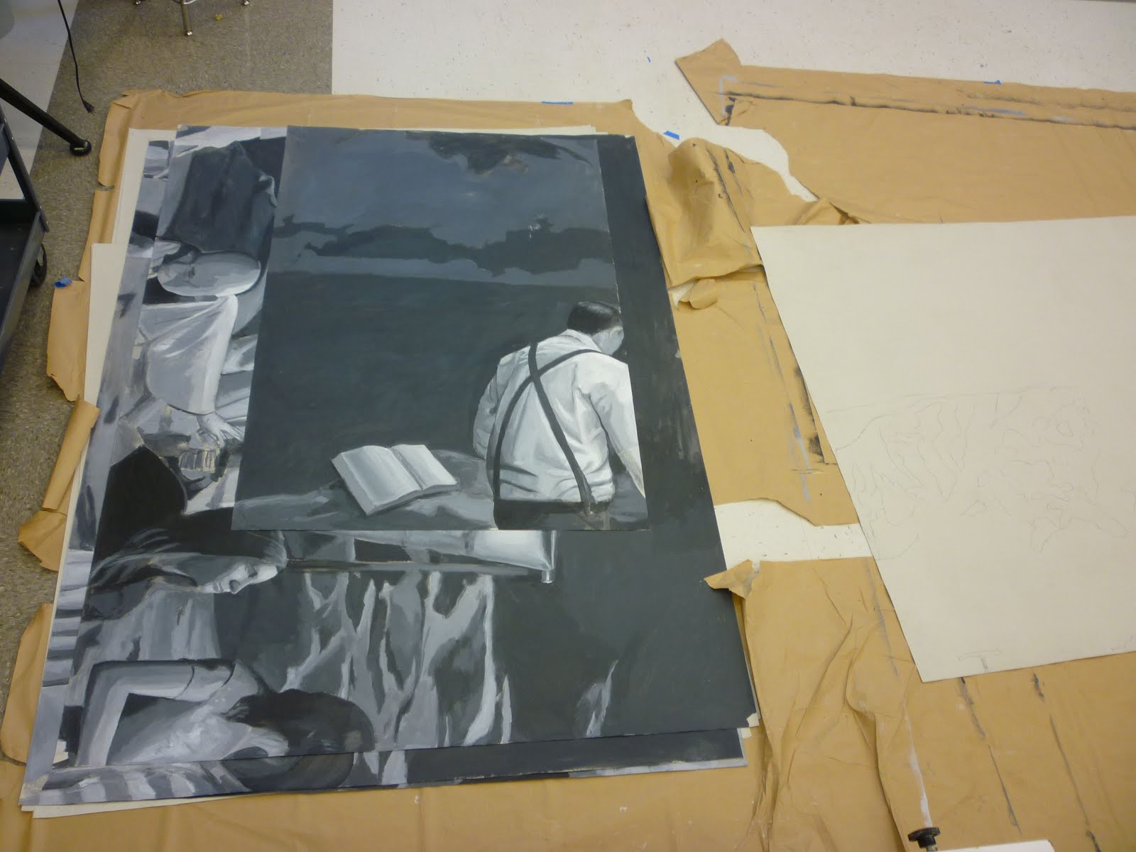
The sections that I'm not working on are stacked on floor to save precious wall space.
 Blocking-in 3rd row.  I found that working on the floor at this stage saves a lot of time. 


 I will admit, for a second I felt like Pollock.
Once sections are blocked-in on floor, they are taped to wall for more detail.
 I was kicked out of the studio Friday afternoon by the maintenance crew.  They will be waxing floors until Wednesday:(
3rd row complete!  Painting objects at a distance can be tricky.  The edges of the objects must be softer so that they recede into the distance.  Also, values and colors will get lighter as objects recede.  This phenomenon is called atmospheric perspective.